

Denmark plans to expand offshore wind energy, and to do so, wants to create an artificial island in the North sea. This plan is based on a cost-benefit analysis, which is based on an estimate of how much electricity generation can be expected from wind turbines in that region. Such wind resource estimates use highly resolved wind fields, turbine characteristics as well as their spatial arrangement, but they typically neglect the atmospheric response to the turbines. Each turbine removes kinetic energy from the atmosphere to generate its electricity, so more turbines remove more energy from the atmosphere, leaving a greater impact behind. What this means is that such estimates typically turn out to be too high (see e.g., here), with a greater bias with greater installed capacity, as we have shown for German offshore scenarios, or in a new study just published. So when a colleague asked me about my opinion, I thought this is a good occasion to use our KEBA approach, which takes the atmospheric response into account, and redo the estimate.
The following serves as a step-by-step illustration of how one can use KEBA to get a wind energy resource estimate. It shows that it does not require much to derive at such an estimate, for very good, physical reasons. And it helps us to understand why in this scenario of the Danish energy island, estimates are unlikely to be substantially lowered by looking at the kinetic energy budget of the region that is at the center of the KEBA approach.
So here is what I did (see flowchart shown in Figure 1):
Step 1: I used the characteristics of a hypothetical, 12 MW wind turbine as a basis,
Step 2: combined it with wind information,
Step 3: defined three scenarios,
Step 4: to then estimate the yields for each scenario without and with the atmosphere responding to the energy that the turbines remove.
To understand the magnitude of the resulting yield reduction, (Step 5, not shown in the diagram) I then diagnosed the kinetic energy budget associated with the three scenarios.

The following description is aimed to be transparent and reproducible, providing the necessary parameter values, links to sources, and describe the assumptions. In case I miss something, or something is not clear enough, please let me know.
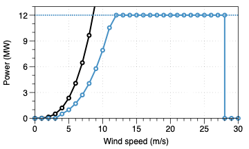
Step 1: Turbine characteristics
At the basis of every wind energy yield estimation is the so-called power curve of the wind turbine. This power curve relates the electricity production (in units of Watt per turbine) to the wind speed (in units of m/s). It is expressed as a mathematical function, with the turbine generation described by the symbol Pgen, and wind speed by v:
Pgen = 1/2 ρ v3 η Arotor
where ρ is the air density (typical value is 1.2 kg m-3), η is the power coefficient (typically around 0.42, see e.g., here), and Arotor is the area spanned by the rotor blades, which depends on the turbine specification.
We also need to adjust this generation rate for certain wind speeds. At low wind speeds below the cut-in velocity (typically below 4 m/s), turbines do not generate any power. At wind speeds between 10 and 12 m/s, the generator reaches its capacity, so we need to limit the value Pgen to the turbine capacity. Also, at high wind speeds of greater than 25 m/s, turbines are typically switched off to prevent damage. The resulting power curve then looks like the one shown in Figure 2 below.
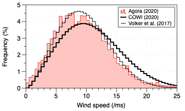
Step 2: Description of the wind forcing
To estimate yields, we obviously need to know the wind conditions of the site, not just in terms of the mean wind speed, but in terms of how often certain wind speeds are observed (we neglect the wind direction here, it does not seem to play a decisive role for this estimate). This can be described by the frequency distribution of wind speeds (see Figure 3 below). It shows how often a wind speed can be found in the region. The shape of this distribution is captured by a Weibull distribution, characterized by two parameters k and A (wikipedia uses λ instead of A, but it is the same thing). We can then use the power curve of the wind turbine together with this frequency distribution to calculate how much power the turbine would produce for a certain wind speed, and by integrating over the frequency distribution, we get the climatological mean yield that is expected from a single turbine at this location.
Step 3: Defining the scenarios
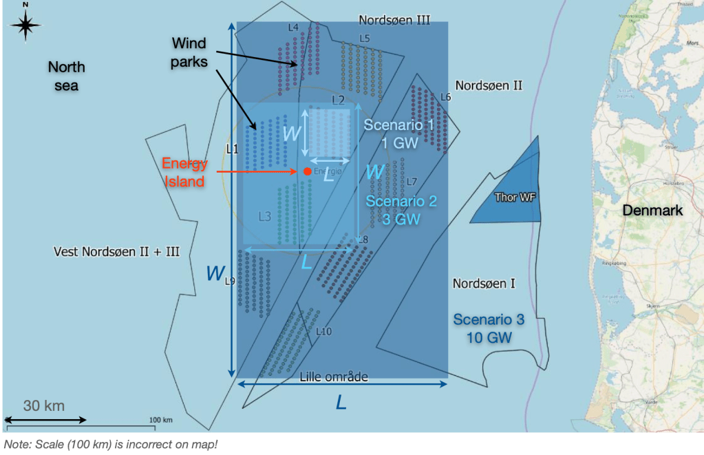
Next we need to know how many wind turbines are being planned to be installed. The described plan for the energy island has two stages (Figure 4): In the first stage, three wind farms of 1 GW of wind turbines each are considered with a total installed capacity of 3 GW (with an installed capacity density of about 4.5 MW km-2 and some spacing between the farms). In the second stage, seven additional wind farms are planned, again with 1 GW capacity each, bringing the total up to 10 GW.
I then considered three scenarios:
Scenario 1 (light blue in Figure 4). The yield of a single 1 GW wind farm. Given the 12 MW turbine characteristics shown above, this translates into 83 1/3 turbines (I know, a fractional turbine seems odd, but mathematically it does not matter). This wind farm occupies an area with a width of approx. W = 17.1 km and a length of L = 14.7 km. I estimated these dimensions on the map so it is a rough estimate.
Scenario 2 (medium blue in Figure 4). The yield for the first stage of 3 GW installed capacity. This would represent 250 wind turbines of 12 MW capacity each. I used a rectangle to enclose the three wind farms on the map, and determined the dimensions of the rectangle to be W = 51 km facing the west, from which the wind blows most frequently, and L = 39.3 km.
Scenario 3 (dark blue in Figure 4). The yield for the second stage of 10 GW installed capacity. This represents 10 times as many wind turbines as in Scenario 1. The rectangle enclosing these wind farms has the dimensions W = 127.8 km and L = 72.9 km.
Step 4: Estimating the yields without and with an atmospheric response
I then obtained two different estimates, both using KEBA as implemented in an Excel spreadsheet, which can be downloaded here (the version called “KEBA-Estimates-DK-Energy-Island”).
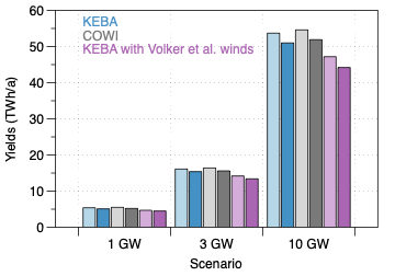
The first estimate (shown by light bars in Figure 5) is derived by using the power curve, combined with the wind frequency distribution, and multiplied with the number of turbines for each scenario. This is an estimate that does not take into account that the turbines remove kinetic energy from the atmosphere and could thereby affect the wind speeds.
The second estimate (darker bars in Figure 5) is basically the same as the first, except that it applies the KEBA reduction factor (abbreviated fred in the KEBA description in Kleidon and Miller, 2020). This reduction factor is derived from the kinetic energy budget of the atmosphere and thus represents the atmospheric response. Its value is always less or equal to one, with fred = 1 representing the case of an isolated wind turbine. It depends on the dimensions of the wind farm region, specifically the width W and downwind length L, the number of installed turbines, and two meteorological attributes – the boundary layer height H (about 700 m), which sets the top of the box needed for the accounting of kinetic energy, and the drag coefficient Cd (about 0.001), which describes the intensity of surface friction. For the setup considered here, this reduction factor is about 0.88 in all three scenarios when the turbines operate below their rated capacity. When the turbines operate at their capacity, the reduction of wind speeds does not affect their yield, because they operate at their capacity anyway.
The estimates with KEBA were done for the Weibull distribution as specified by the COWI report (blue bars in Figure 5), as well as for the wind forcing described for Region B in Volker et al. (2017) (purple bars). These are compared with the published estimates of the COWI report (grey bars). The estimates are very close. KEBA estimates a reduction by 5% due to the atmospheric response, while the COWI study included a 5% loss due to wake turbulence. Although the two forms of losses are related, that the same magnitude of reduction is used is somewhat of a coincidence.
The turbines would nevertheless run very efficiently, even despite this 5% reduction. This efficiency can be expressed by the Capacity Factor (CF), the ratio of the mean yield over the capacity of the turbine. This factor drops from about 61% down to 58% in all three cases, consistent with the numbers reported by COWI. With the forcing by Volker et al. (2017), these efficiencies are lower (54%, dropping down to 51% with atmospheric response) because the wind speeds are lower. These efficiencies are nevertheless notably higher than those we evaluated in the Agora report for offshore wind farms in the German bight, where capacity factors were around 50-55% for an isolated wind turbine and dropped down to 25% when 145 GW were installed in the region.
Step 5: Using the kinetic energy budget to understand the results
Given that we found quite substantial reductions in the Agora study on German offshore wind resources, why is the reduction so small in this case? To get an understanding for this, it is instructive to look at the kinetic energy budget of the atmosphere of the atmospheric volume associated with the shaded areas of Figure 4. In essence, the reduction is small when the natural kinetic energy fluxes in and out of the box are much larger than the energy removed by the wind turbines. I know, this almost sounds trivial, but we can put numbers on it to demonstrate this further.
The kinetic energy budget is not something that is being looked at by meteorologists. Don’t ask me why, it’s a mystery to me, but it is right at the very core of what wind turbines are about because that is what feeds their energy generation. It thus helps us to understand of what is going on. In KEBA we provide formulations to estimate the different terms of this budget, with the results shown in Figure 6. These formulations are described in the KEBA paper, and are used in the spreadsheet.
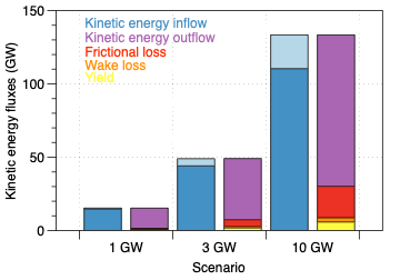
So let’s look at the kinetic energy fluxes that enter a virtual box that delineates the atmosphere that encloses the wind farms. The bottom area of this box is shown by the rectangles in Figure 4, and vertically it extends to the height of the boundary layer. For the 1 GW scenario, this box is smaller, so the influxes of kinetic energy are also smaller. The 10 GW scenario covers a much larger area, so the kinetic energy fluxes are larger as well. The blue bars in Figure 6 denote the input by atmospheric transport, with dark blue bars being transported horizontally from upwind regions, and the light blue portion being brought down from the atmosphere above. This energy is then either taken out by the wind turbines (yellow), lost by wake turbulence (orange), depleted by surface friction (red), or it exits the box downwind (purple). What we notice is that in all cases, the energy withdrawn by the wind turbines represents a tiny fraction of what comes in – so the atmosphere does not feel the wind turbines by much. In fact, in each scenario, the yields represent about 4% of the influx of kinetic energy. This is not much, so the reaction in the atmosphere is within the same range. Note that wake dissipation, the mixing behind the turbines to fill the wake, contributes an additional loss term to kinetic energy, so that this does not translate directly to the 5% loss described above.
This relatively low fraction of energy removed from the atmosphere, and the small response is a reflection of the wind farms being spread over a sufficiently large area. When compared to the scenarios we considered in the Agora study, for instance 55 GW installed over 2800 km2, then this represents a much, much greater number of turbines installed over less space, and the mean capacity factor drops to around 30%. That reduction is a reflection of the turbines taking more than 30% of the kinetic energy out of the atmosphere, leaving an obvious impact behind that is responsible for the reduced efficiency. Ultimately, this led to the conclusion in the Agora report that offshore wind energy needs sufficient space, otherwise the efficiency of the wind turbines is substantially reduced. And in the case of the Danish energy island, it seems that the turbines do have sufficient space to remain efficient.
Concluding remarks
In summary, I hope this post is helpful to make wind resource estimates more transparent, and to illustrate how KEBA can be used to estimate potential atmospheric depletion effects in a relatively simple, yet physically-based way. The yield estimates reproduce the much more elaborate derivation described in the COWI report. One could, in principle, repeat this exercise with different turbine characteristics. But the outcome would be more or less the same. This is because the dominant factor that shapes the energy yields and their possible reduction by the atmosphere is governed by the regional kinetic energy budget – the budget that sets the energy resource that the wind turbines tap into to generate the electricity.
The kinetic energy budget also explains why one would not expect large reductions in yield in the scenarios of the Danish energy island, which is quite different than what we have found in the Agora study. The reductions are low, because the kinetic energy fluxes in and out of the region are much larger than what the turbines are expected to take out to generate the electricity.
You can use the spreadsheet and play around to see how many turbines would need to be installed in the region to see stronger reductions in yield, or how the geometry of the region affects the reduction effect.
I thank Jonathan for providing me with the wind fields from the WRF simulation, which he in turn got from Marc and Jake.
References
Website of the Danish energy island (which is also the source of the featured image).
KEBA Excel spreadsheet for the case of the Danish energy island in the North sea.
Agora Energiewende report on an re-evaluation of the offshore wind energy resource in the German bight of the North sea.
COWI report on the wind resource estimate associated with the Danish energy island in the North sea.

Sehr geehrter Herr Kleidon,
mein ‘Reply’ ist Off-Topic zu diesem Artikel, aber eventuell könnten Sie meinen Wunsch in diesem Blog dennoch einmal berücksichtigen: Könnten Sie den Artikel https://www.welt.de/wissenschaft/article231952049/Warum-die-Erde-mehr-Waerme-aufnimmt-als-sie-ins-All-abgibt.html vom Standpunkt der Thermodynamik einmal genauer erläutern. Dies würde mich sehr interessieren, da ich gerade Ihr Buch ‘Thermodynamic Foundations of the Earth System’ lese.
Vielen Dank f ür Ihre Aufmerksamkeit.
Mit freundlichem Gruß
Peter Kessler
P.S.: Ich habe leider keine andere Möglichkeit zur Kontakaufnahme gefunden.
LikeLike
Sehr geehrter Herr Kessler,
ich habe Ihre Anfrage erhalten. Ich bin mir nicht ganz sicher, worauf Sie hinauswollen, aber ich versuche es mal mit einer Antwort. Bei dem Artikel geht es um die Energiebilanz der Erde (oder besser, die Bilanz der thermischen Energie), die sich mit der Klimaerwärmung ändert. Vereinfacht können Sie sich das wie folgt vorstellen: Die Erwärmung der Erde durch Absorption von Solarstrahlung bleibt unverändert. Das führt dem System thermische Energie zu. Die Erde verliert Wärme durch Abstrahlung, wobei die abgestrahlte Energie von der Erdoberfläche auf dem Weg ins Weltall noch von der Atmosphäre absorbiert und remittiert wird, u.a. auch zurück an die Erdoberfläche (der sog. Treibhauseffekt). Bei mehr Treibhausgasen in der Atmosphäre wird mehr absorbiert, emittiert, und auch mehr an die Oberfläche zurückgestrahlt, und die Oberfläche wird wärmer. Das Nichtgleichgewicht, welches im Artikel beschrieben wird, hängt damit zusammen, dass der Ozean Wärme aufnimmt, und es somit zu einem Ungleichgewicht in den Strahlungsflüssen an der Systemgrenze Erde-Weltall kommt, welches man mit Satelliten beobachten kann. Dies ist ein temporärer Effekt, allerdings für ein paar hundert Jahre (wenn ich mich recht erinnere), bis die Temperatur des Ozeans zu den Strahlungsflüssen passt.
Ich hoffe, dies hilft. Und ich werde im Blog sehen, wie ich Kontaktinformationen einbauen kann.
Mit freundlichen Grüßen,
Axel Kleidon
LikeLike